I am currently taking a data visualization course, and one of the first assignments was to find a bad graph and fix it. To do so, I needed to find the original data and reproduce the graph by applying data visualization best practices. I used Power BI to help me with the task, and I thought I’d share the results.
I stumbled upon a feature published in The New York Times Magazine a few weeks ago, titled “How the Trump Administration Is Remaking the Courts“, which included the following illustration:

Important note: my interest in fixing the graph above is purely technical. This blog is strictly not political, and I am going to try to stay as neutral as possible.
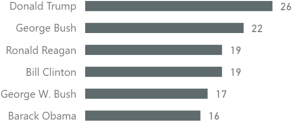
What is the above graph showing? The original caption is as follows: “Appellate Judgeships Confirmed During First Congressional Term”. What does it mean? To someone who is not well-versed in the American judicial system, like me, it doesn’t mean much. Here are a few bullet points to help you understand what the graph is telling us:
- “Appellate Judgeships” means judge vacancies in the Court of Appeals
- Court of Appeals judges are nominated by US presidents and then confirmed in the Congress
- Every US Congress term runs for two years, starting every odd year
- The presidential term in US is four years, which generally coincides with two Congresses
In plain English, the graph shows how many Court of Appeals judges have been confirmed during the first two years of presidency of the last six US presidents.
What are the problems with the chart? I see at least four:
- The axis does not start at zero
- Chart junk
- The red color bears no meaning
- Questionable numbers
Let’s deal with each one separately.
The axis does not start at zero
In most cases, you want your bar charts (or gavel charts) to start at zero; this one starts at 14. Why is it bad? Because it misrepresents the differences in values. Note how Donald Trump’s gavel handle is 10 times longer than that of Barack Obama, while the difference in numbers is only 60%. This is quite misleading.
More precisely, the lie factor of this graph is about 15:
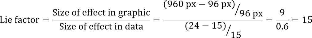
As a reference, a 100% accurate graph would have a lie factor of 1, and a chart that doubles the effect in graphic would have a lie factor of 2.
Chart junk
In the illustration, we see gavels, which do not provide the viewer any new information. Yes, gavels are a reference to courts, but in this case they are just chart junk that make interpreting the chart more difficult. The uneven ends of the handles in some cases increase the lie factor even further.
In addition to this, at least to me, the angled handles are not as easy to compare as vertical or horizontal bars.
Note how the red circles of Clinton and Trump, which look like stickers, are both slightly distorted. I couldn’t see any clarification on this — my only guess is that Clinton almost got impeached, and there are some people who want to get Trump impeached, which would explain the shape of the stickers.
The red color has no meaning
Usually, the red color is used to draw attention to something important. In this graph, all labels are bright red, so the color does nothing more than comply with the overall color scheme.
Questionable numbers
This is the most serious issue. No matter how beautiful or ugly a graph is, it must show the correct values — everything else is secondary.
To quickly verify the numbers yourself, you can use Wikipedia — there is a page of judges appointed for every US president. The section of interest is “Court of Appeals”, and we only want to count the first two years for each president:
- Ronald Reagan (19 — the only matching value)
- George Bush (22, not 18)
- Bill Clinton (19, not 18)
- George W. Bush (17, not 16)
- Barack Obama (16, not 15)
- Donald Trump (26, not 24)
Granted, Wikipedia is not always correct, so I decided to use an official source — the Federal Judicial Center website. One of the files that contains the information we need is the Federal Judicial Service file in CSV format.
What else do we need to verify the numbers? I like using as little manual effort as possible, so I also got the presidency start for each president, as well as the dates of each Congress from Wikipedia. These are the two Wikipedia pages I used:
The only table I typed manually was the following one, which was necessary to align the spelling between The New York Times and Wikipedia:
| The New York Times | Wikipedia |
|---|---|
| Ronald Reagan | Ronald Reagan |
| George Bush | George H. W. Bush |
| Bill Clinton | Bill Clinton |
| George W. Bush | George W. Bush |
| Barack Obama | Barack Obama |
| Donald Trump | Donald Trump |
This is what my Query Dependencies view is like:
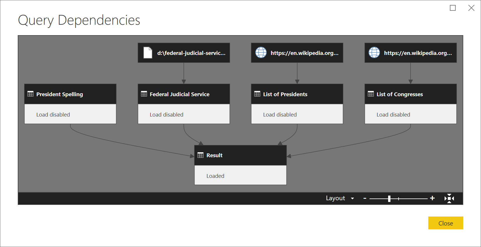
Technical note: unfortunately, I had to download the CSV file from Federal Judicial Center instead of connecting to it directly on the web because of incorrect HTTP headers. Apparently, this issue has no workaround, according to Microsoft here.
Here is the general approach I took to verify the numbers:
- For each of the six presidents, I got the presidency start year
- I filtered all the congresses to those that start in the same year as the six presidents in (1) and got a list of dates for each congress
- Then I added the list of Court of Appeals judges confirmed during the dates from (2)
- Finally, I summarized the number of confirmed judges for each president
If you are charitable, you will assume that the differences are because The New York Times excluded Federal Circuit appointments — if it were so, the numbers would match. This, however, is not stated anywhere, as far as I can see. Maybe I missed this clarification somewhere in 8,000+ words, but at least I can say I searched for “Federal Circuit” in the text and got no results.
If you exclude any values from your graph, you must clearly state so, ideally explaining your reasons for doing it.
Correcting the chart
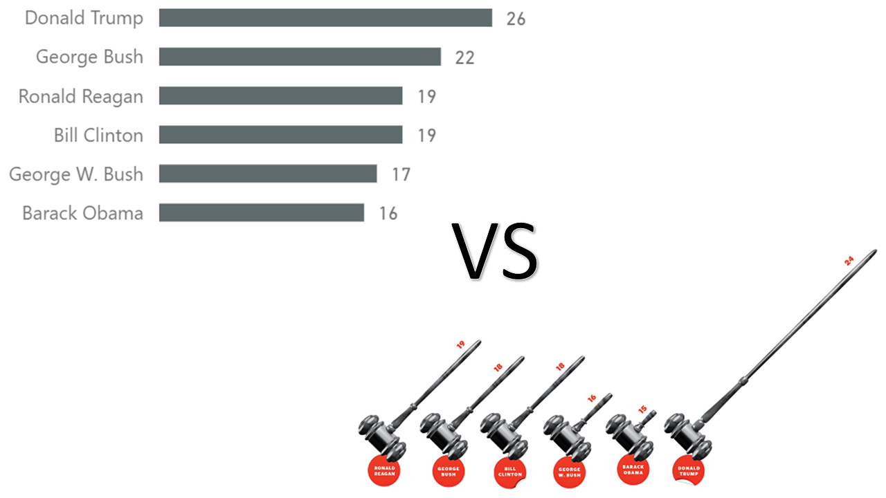
It is best to sort the chart by values rather than the order in which the presidents held office because the main objective of the graph is to show the difference in numbers, not how they changed across time.
Once you apply all the fixes and produce a chart in Power BI, you get the following visual:
Note how the differences in values are not as dramatic now.
Conclusions
As you can see, creating a bad chart that has just six numbers is not so difficult. I am not sure if the original illustration was politically motivated, but it doesn’t matter — a bad visualization is bad anyway. Someone may say that my bar chart looks dull — I always prefer a dull truth rather than a beautiful lie.
While more and more people realize that Power BI is a great business intelligence tool, Power BI can also be used for “everyday” tasks. I don’t verify numbers and rebuild charts from magazines every day, but you get the idea. Without Power BI, I would spend more time and could potentially make errors when verifying the numbers.
I encourage the curious reader to download the Power BI workbook below to see the exact steps I took to combine the three data sources mentioned in this blog post.
I’d like to thank Matt Allington and Dr Demetris Christodoulou for providing feedback on the draft of this blog post.
Download the Power BI Desktop workbook: FactChecking.pbix