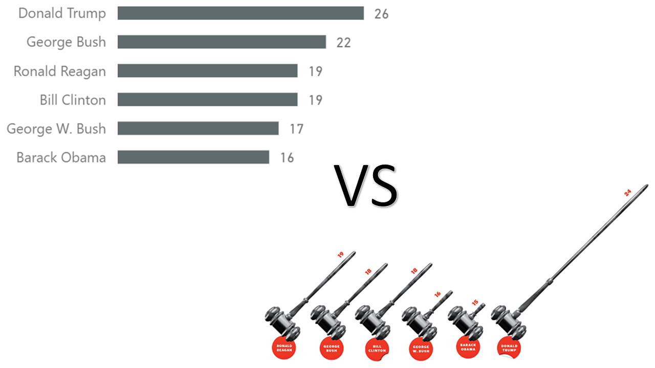
I am currently taking a data visualization course, and one of the first assignments was to find a bad graph and fix it. To do so, I needed to find the original data and reproduce the graph by applying data visualization best practices. I used Power BI to help me with the task, and I thought I’d share the results. Continue reading “Checking facts and creating better graphs with Power BI”