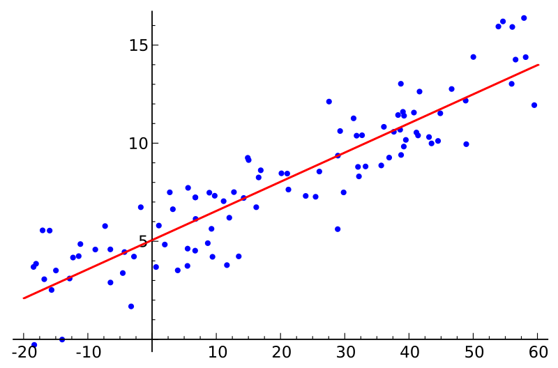
DAX, originating in Power Pivot, shares many functions with Excel. As of 2017, some of the functions, such as SLOPE and INTERCEPT, exist in the latter but not in the former. The two functions can be used for a simple linear regression analysis, and in this article I am sharing patterns to easily replicate them in DAX. But first, why would you want to do such analysis?
Update 28 February 2023: LINESTX is now used to calculate the slope and intercept. Note that LINEST and LINESTX allow you to perform multiple linear regression as well!
Update 2 December 2017: the sales example was updated to display the correct Estimated Sales figure at the grand total level.
How can I use simple linear regression?
With simple linear regression, you can estimate the quantitative relationship between any two variables. Let’s say you have the following data model:
| Name | Height (cm) | Weight (kg) |
| Harry | 166 | 54 |
| Hermione | 164 | 51 |
| Ron | 173 | 73 |
| Ginny | 171 | 55 |
| Dumbledore | 181 |
Note how Dumbledore’s weight is unknown — we are going to predict it with simple linear regression.
Linear regression has been done in DAX before (by Rob Collie and Greg Deckler, for instance), but my approach uses the new DAX syntax, which makes the calculations very easy.
Simple linear regression pattern
Simple linear regression can be done in just one measure:
Simple linear regression =
VAR Known =
    FILTER (
        SELECTCOLUMNS (
            ALLSELECTED ( Table[Column] ),
            "Known[X]", [Measure X],
            "Known[Y]", [Measure Y]
        ),
        AND (
            NOT ( ISBLANK ( Known[X] ) ),
            NOT ( ISBLANK ( Known[Y] ) )
        )
    )
VAR SlopeIntercept =
    LINESTX(Known, Known[Y], Known[X])
VAR Slope =
    SELECTCOLUMNS(SlopeIntercept, [Slope1])
VAR Intercept =
    SELECTCOLUMNS(SlopeIntercept, [Intercept])
RETURN
    Intercept + Slope * [Measure X]
To make it work for you, replace the
- Red part with your category values column reference
- Green parts with your independent values measure (twice)
- Blue part with your dependent values measure
Estimating Dumbledore’s weight
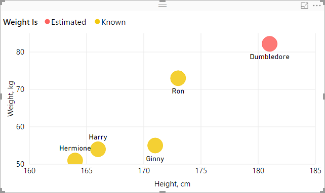
We can now estimate Dumbledore’s weight and, with a little more DAX, build the following graph:

Note how we show known weight values when weight is known, but we display estimated weight in case where weight is not known.
Other ways to use the pattern
You are not limited to using measures for known X and Y values — you can also use columns, thanks to row context being present in SELECTCOLUMNS. For example, to estimate future sales, you can use dates in place of Measure X, like so:
Simple linear regression =
VAR Known =
    FILTER (
        SELECTCOLUMNS (
            ALLSELECTED ( 'Date'[Date] ),
            "Known[X]", 'Date'[Date],
            "Known[Y]", [Measure Y]
        ),
        AND (
            NOT ( ISBLANK ( Known[X] ) ),
            NOT ( ISBLANK ( Known[Y] ) )
        )
    )
VAR SlopeIntercept =
    LINESTX(Known, Known[Y], Known[X])
VAR Slope =
    SELECTCOLUMNS(SlopeIntercept, [Slope1])
VAR Intercept =
    SELECTCOLUMNS(SlopeIntercept, [Intercept])
RETURN
    SUMX (
        DISTINCT ( 'Date'[Date] ),
        Intercept + Slope * 'Date'[Date]
    )
Note that to display the correct amount at the grand total level, you also need to modify the RETURN expression. In case of sales, it is appropriate to use SUMX; if you deal with temperatures, for example, you will probably use AVERAGEX.
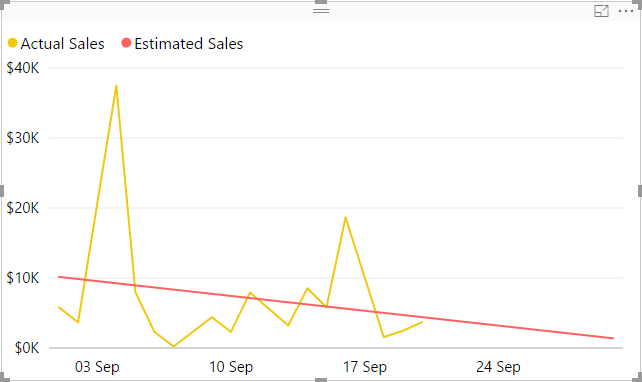
You can then build the following graph:

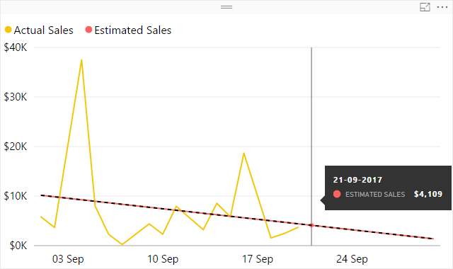
The red line looks a lot like a trend line, doesn’t it? In fact, if you add a trend line to the graph, it will be exactly the same as red line:

There are at least two reasons to consider calculated trend lines:
- With the built-in trend line, you can only infer its values from the Y axis, while the calculated trend line allows you to see the values explicitly
- As of September 2017, Power BI allows you to only add trend lines for numeric or datetime axes. As soon as you use strings (month names, for instance), you lose the ability to add trend lines. With simple linear regression, you can calculate them yourself, as long as you have sequential numeric values to use as known X values
If you think this pattern is useful, please give kudos to it in the Quick Measures Gallery.
Happy forecasting!
Sample Power BI file: Simple linear regression.pbix