
At the moment, Power BI has two visuals that support two Y axes: the line and stacked column chart, and the line and clustered column chart. In the May 2018 release of Power BI Desktop, there is going to be an important enhancement to these charts (as well as the various line visuals): we will be able to set the line stroke width to zero (this can already be done in Power BI service). In this blog post, I am going to show two use cases for it.
Categorical X axis
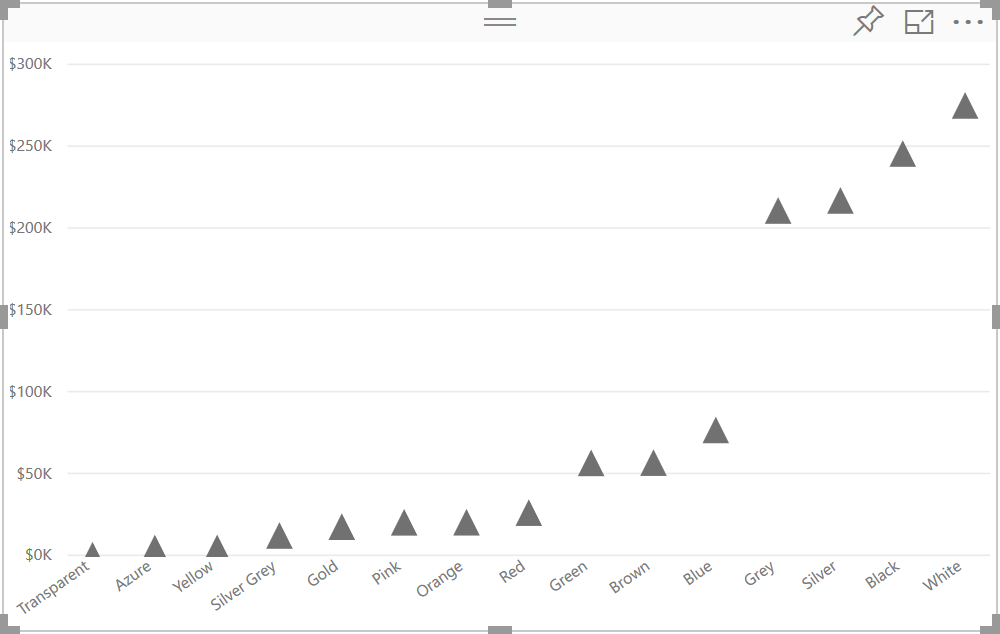
In some cases, having a second Y axis makes a lot of sense. For example, you may need to show measures of different scales, such as dollar values and percentages, on the same chart:
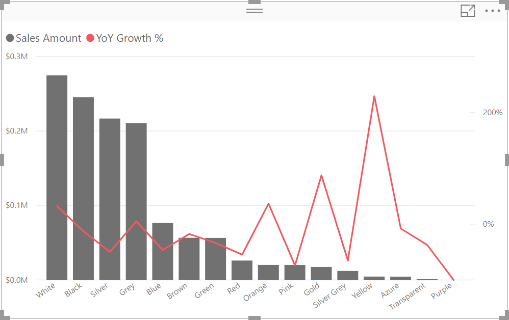
In this example, we have colors on X axis; because the X axis items are not sequential, displaying the line makes no sense. If we had dates on X axis instead, a line would make a perfect sense, but not for colors.
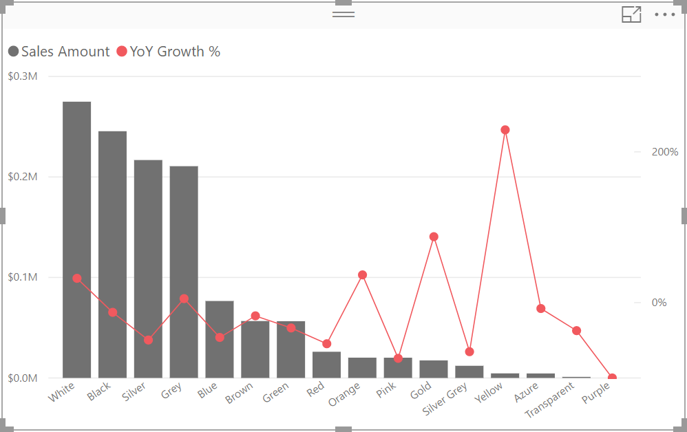
To address the issue, you could turn markers on. To add markers, you need to click Format > Shapes > Show marker. You still couldn’t get rid of the line though, even by reducing the stroke width to 1:
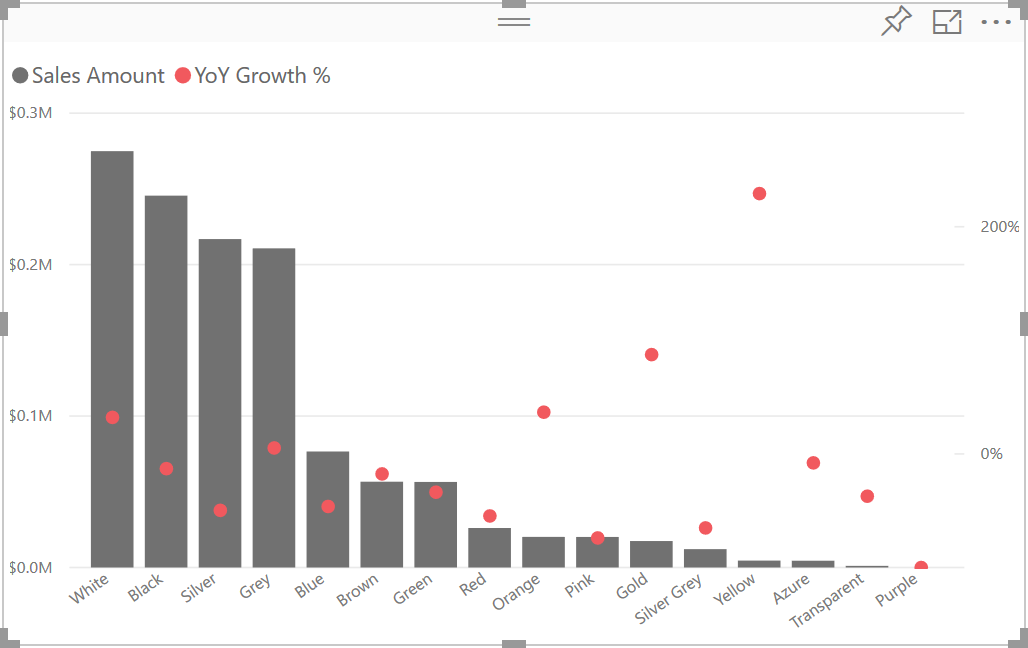
Now you will be able to set the stroke width to zero, making the chart look better:
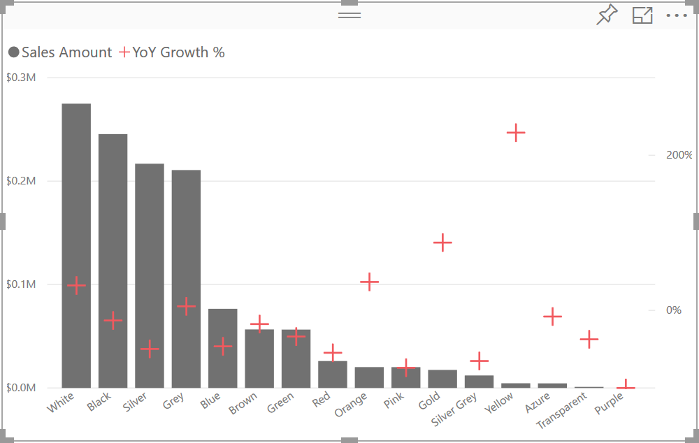
If desired, you can change formatting of the markers, including the shape (there are eight available):
Also, you can create line charts with markers only:
This feature is available for the area charts too.
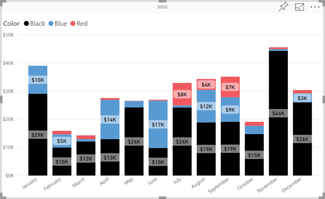
Column totals for stacked column charts
In some cases, you may need to show column totals, which a default stacked column chart does not allow you to do. If you turn the data labels on, you will see the values of each column segment:
To show column totals, you could use the same measure (Sales Amount in this example) to display a line in a stacked column combo chart:
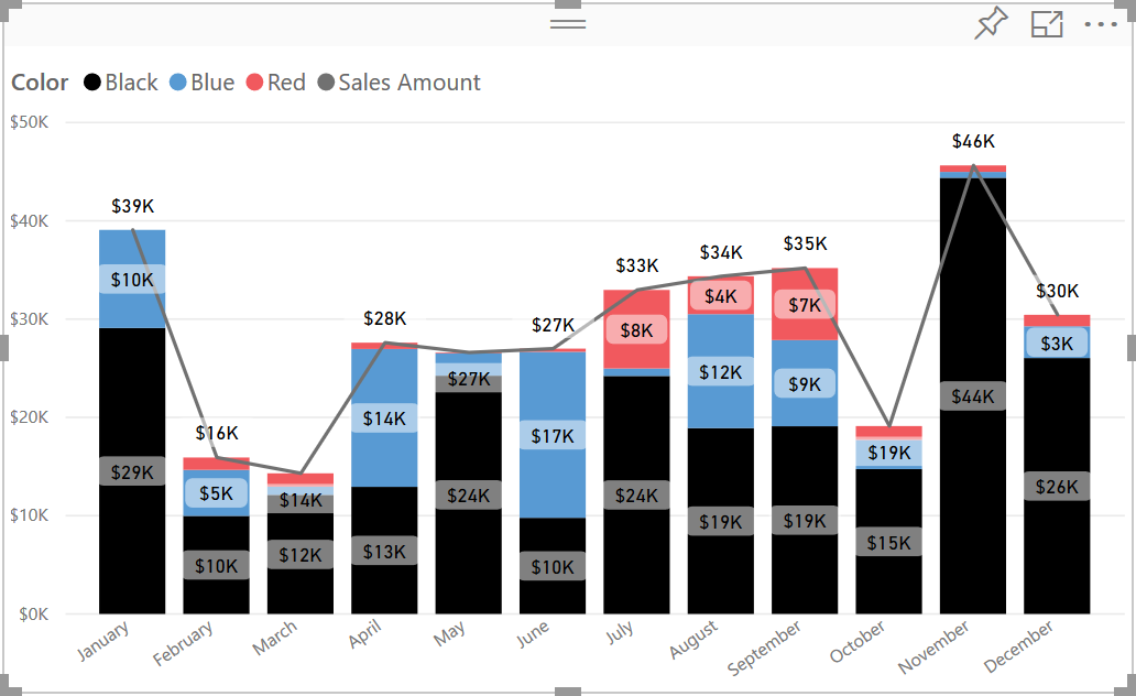
The side-effect of this is the line that does not add any value. To alleviate the issue of having the extraneous line, you could try to change its color to white:

This still looked odd, though. Changing the line stroke width to zero hides the line completely — exactly what we need:
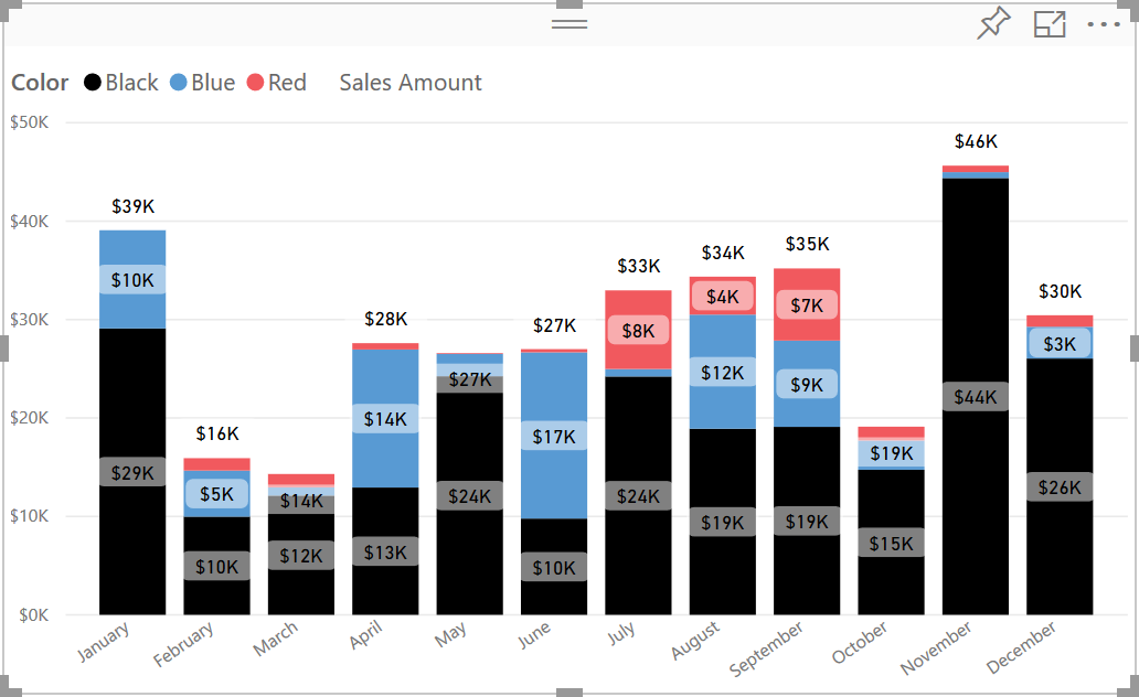
Unfortunately, at the moment of writing (April 2018), it is not possible to turn off the data labels for column items, while retaining the data labels for line items. If you want this feature to be added, please vote for it at Power BI Ideas: Independent Data Label Controls in Combo Charts.
Update July 2018: you can now customize the visibility of detail labels for each series!
P. S. I remember asking Amanda Cofsky for this feature at the 2017 Power BI World Tour; this is yet another proof that the Power BI team listens to its users!

P. P. S. I can’t believe it’s been almost five months since my previous blog post — that’s because I’ve been busy writing Exam Ref 70-778: Analyzing and Visualizing Data by Using Microsoft Power BI, which should come out in a month or so!