Currently, Power BI does not have a built-in feature that enables you to switch between hierarchy levels with a slicer. While some field wells let you use a hierarchy, others, such as Legend, do not. In this article, I am showing a way to choose a hierarchy level dynamically.
Creating the hierarchy table
For education purposes, I am going to use a simplistic data model:
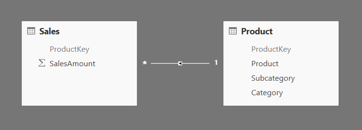
These tables have been imported from the AdventureWorksDW2014 database.
We are not going to create Power BI hierarchies — instead, we are going to imitate them, so that we can choose the desired hierarchy level with a slicer.
First, we need to create a new calculated table — ‘Product Hierarchy’:
Product Hierarchy =
UNION (
    SELECTCOLUMNS (
        'Product',
        "ProductKey", 'Product'[ProductKey],
        "Name", 'Product'[Product],
        "Level", "Product",
        "LevelNumber", 1
    ),
    SELECTCOLUMNS (
        'Product',
        "ProductKey", 'Product'[ProductKey],
        "Name", 'Product'[Subcategory],
        "Level", "Subcategory",
        "LevelNumber", 2
    ),
    SELECTCOLUMNS (
        'Product',
        "ProductKey", 'Product'[ProductKey],
        "Name", 'Product'[Category],
        "Level", "Category",
        "LevelNumber", 3
    )
)
In this calculated table, we are duplicating portions of the ‘Product’ table and creating two new columns: Level and LevelNumber. The former is used to navigate within the product hierarchy; the latter is a sorting column for the former.
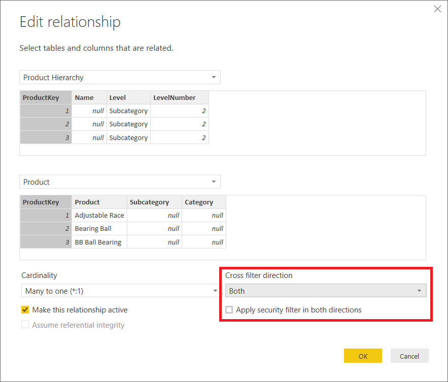
Next, we need to relate this table to the ‘Product’ table and set Cross Filter Direction to Both:
At this stage, we can already choose the hierarchy level dynamically.
Usage examples
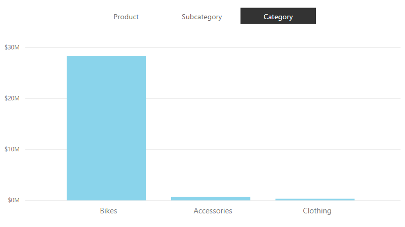
We can use the Name column as a categorical field in a visual and the Level column as a slicer: 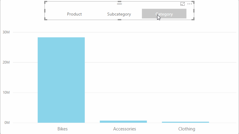
This may not be particularly exciting, because you can achieve the same effect by creating a standard hierarchy.
However, you can also use the Name column in a legend, and Power BI does not support the usage of hierarchies as legend by default.
In addition to this, you can use the Name column in a table or matrix visual.
Showing only one level at a time
Unless we make a selection in the Level slicer, we are going to see all hierarchy levels at once. This can be confusing to a user. We can create a measure that checks whether a level has been selected, and if not, then it chooses the default level. In this example, we show Category by default:
Safe Sales =
IF (
    CALCULATE (
        HASONEVALUE ( 'Product Hierarchy'[Level] ),
        ALL ( 'Product Hierarchy'[Name] )
    ),
    [Sales Amount],
    CALCULATE (
        [Sales Amount],
        'Product Hierarchy'[Level] = "Category"
    )
)
Note that we have to remove any filters on the Name column when we check whether only one Level has been selected. This is because if we use Name as category, then it becomes part of filter context, and one Name has only one Level (the reverse is not true of course).
Performance considerations
It is important to understand that bidirectional filtering can be costly with large dimensions, especially since in this solution, we are effectively duplicating our ‘Product’ table.
One possible optimization is to reduce the number of rows to only those that we absolutely need. In the Adventure Works database, the ‘Product’ table has 606 rows, which results in ‘Product Hierarchy’ having 1,818 rows. We can filter the table so it only contains those product keys that appear in the Sales table:
Product Hierarchy =
VAR ProductHierarchy =
    UNION (
        SELECTCOLUMNS (
            'Product',
            "ProductKey", 'Product'[ProductKey],
            "Name", 'Product'[Product],
            "Level", "Product",
            "LevelNumber", 1
        ),
        SELECTCOLUMNS (
            'Product',
            "ProductKey", 'Product'[ProductKey],
            "Name", 'Product'[Subcategory],
            "Level", "Subcategory",
            "LevelNumber", 2
        ),
        SELECTCOLUMNS (
            'Product',
            "ProductKey", 'Product'[ProductKey],
            "Name", 'Product'[Category],
            "Level", "Category",
            "LevelNumber", 3
        )
    )
RETURN
    FILTER (
        ProductHierarchy,
        [ProductKey] IN VALUES ( Sales[ProductKey] )
    )
In case of Adventure Works, this results in a table with 474 rows, which is even smaller than the Product table. As always, the optimization technique that you need to choose depends on your particular data model.
Download sample file: Dynamic Hierarchy.pbix